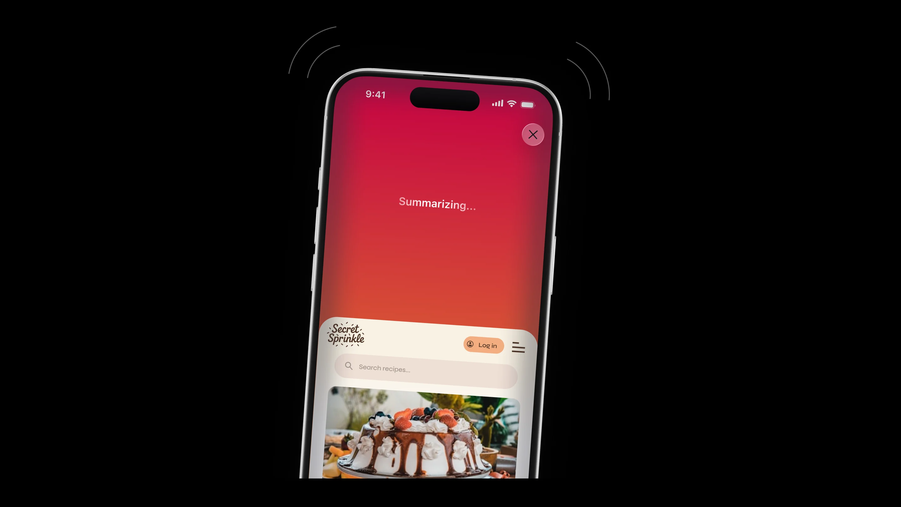
Before there were apps, algorithms, or feeds that decided what you should see, there was Mozilla. A community of engineers, designers, and dreamers who believed the internet should belong to people.
But the web had changed.
The noise had multiplied, the reading had stopped, and comprehension (the very thing Mozilla was fighting for) was slipping away.
The internet was supposed to make us smarter and more capable. Instead, our thumbs ache from scrolling. We began to drown in endless words.
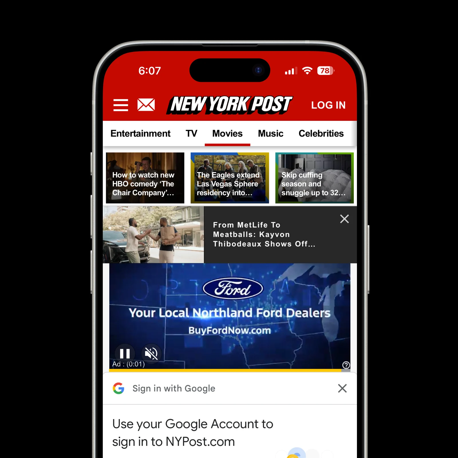
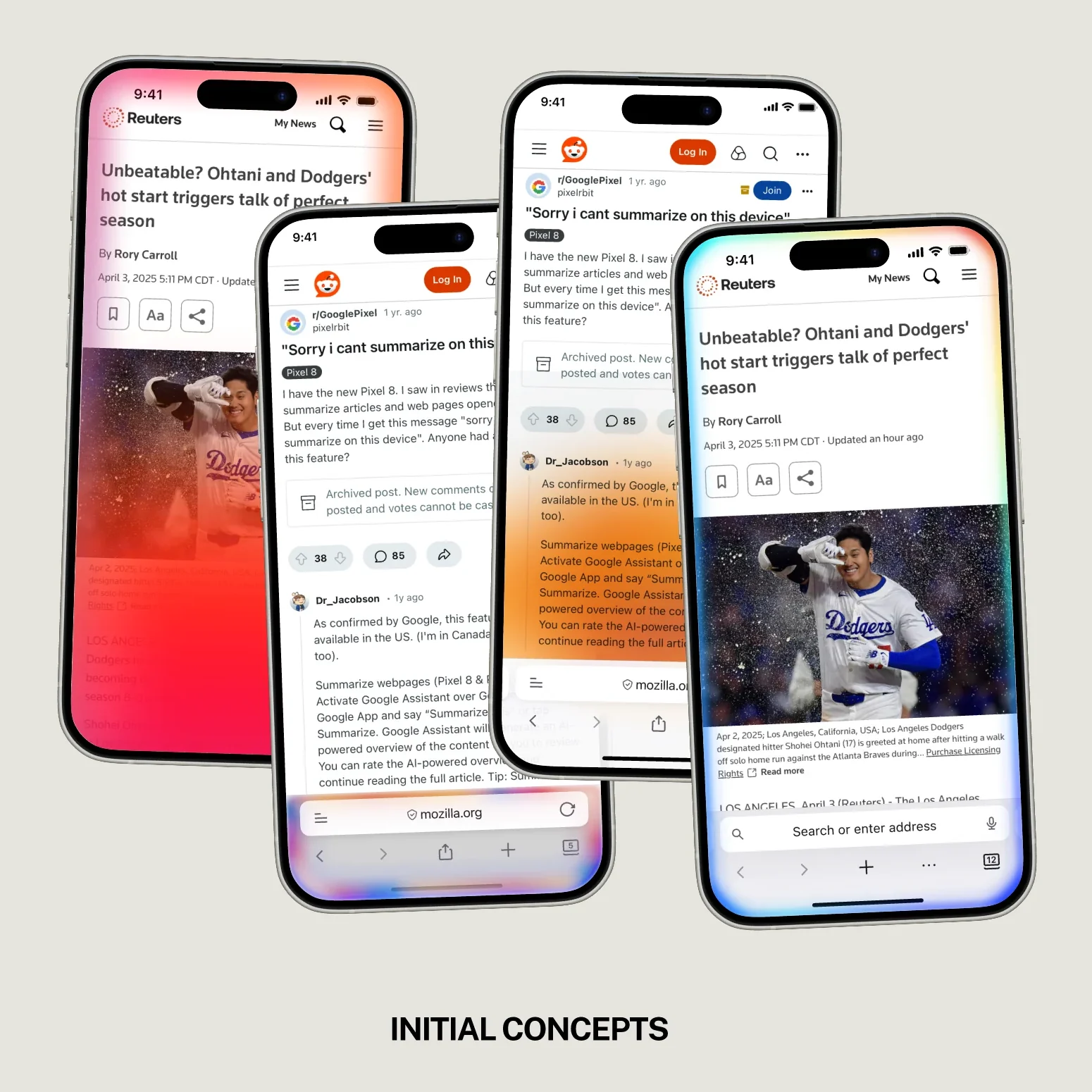
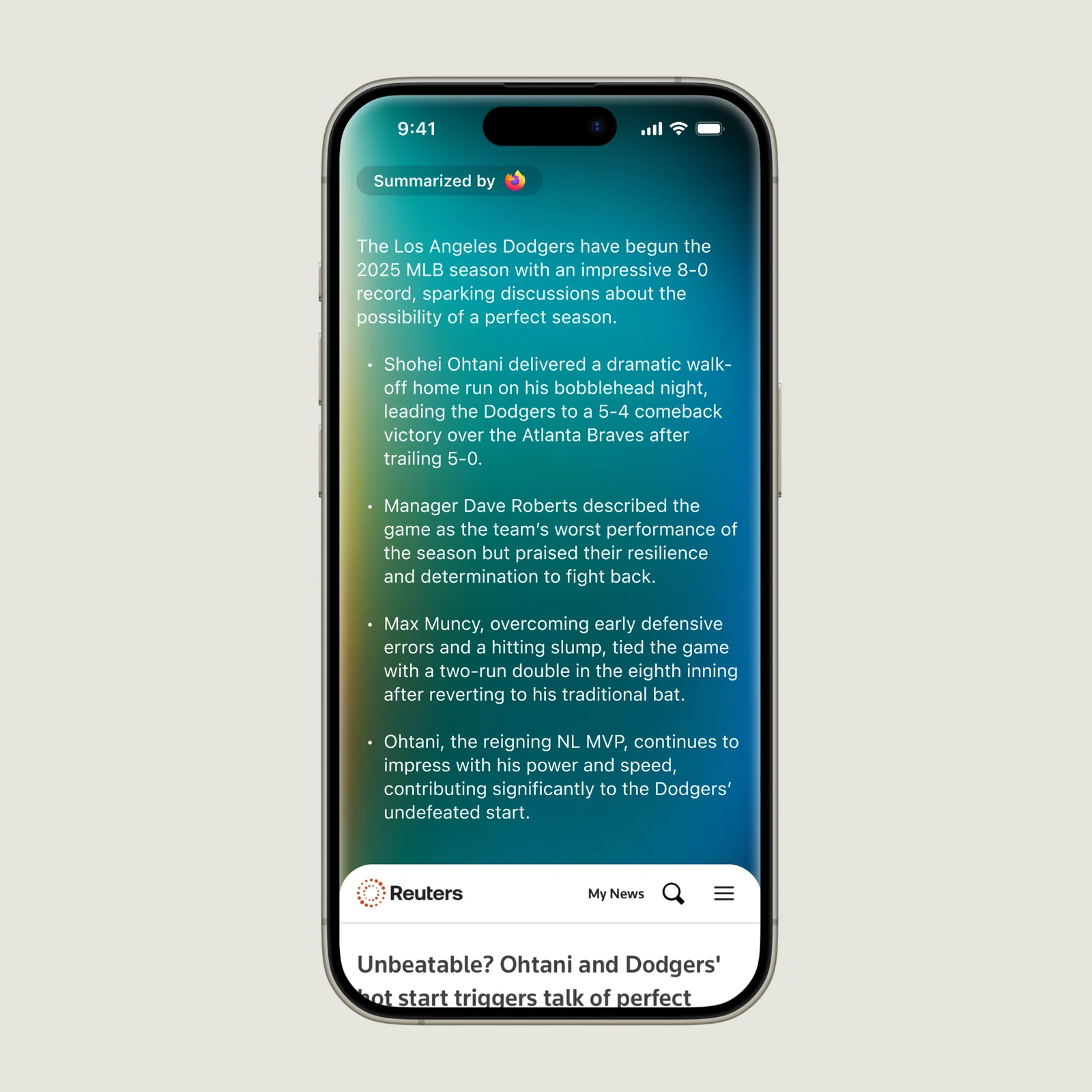
Shake your phone to summarize a web page.
Upstory was brought in to build a better mobile experience, to make the web useful again. The idea was simple: one gesture, and any page becomes something you can actually read.
Prototyping the feel
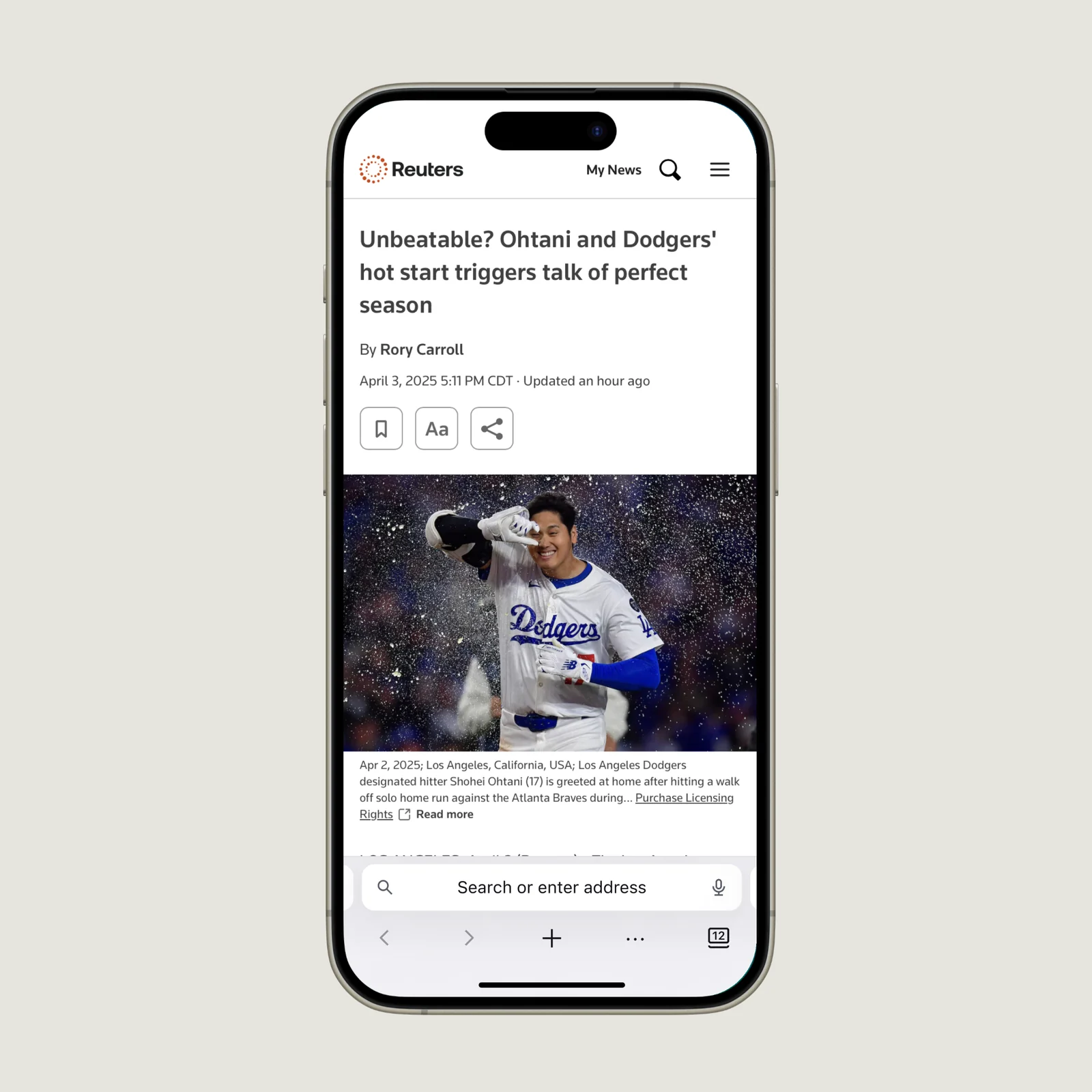
To help actualize our vision, we created prototypes to see how the interaction would actually feel.
A philosophical challenge
It wasn’t just a design challenge; it was a philosophical one. We had to prove it would feel right.
- How short is too short?
- How do you shorten without losing value?
- How can we be sure it doesn’t break searching habits?
- Should our AI be opinionated?
- What if we get hate comments on using AI?
- Can AI serve comprehension, not slop?
- Would people trust an AI summary?
- How do we serve AI content while protecting someone’s privacy?
- Should we censor content that doesn’t align with our philosophy?
- Will investing in this set us apart from the new, more appealing browsers like Perplexity?
Refinement
As the design came together, every stakeholder brought a new question. Each one shaped how the summary looks, moves and respects the page it came from.
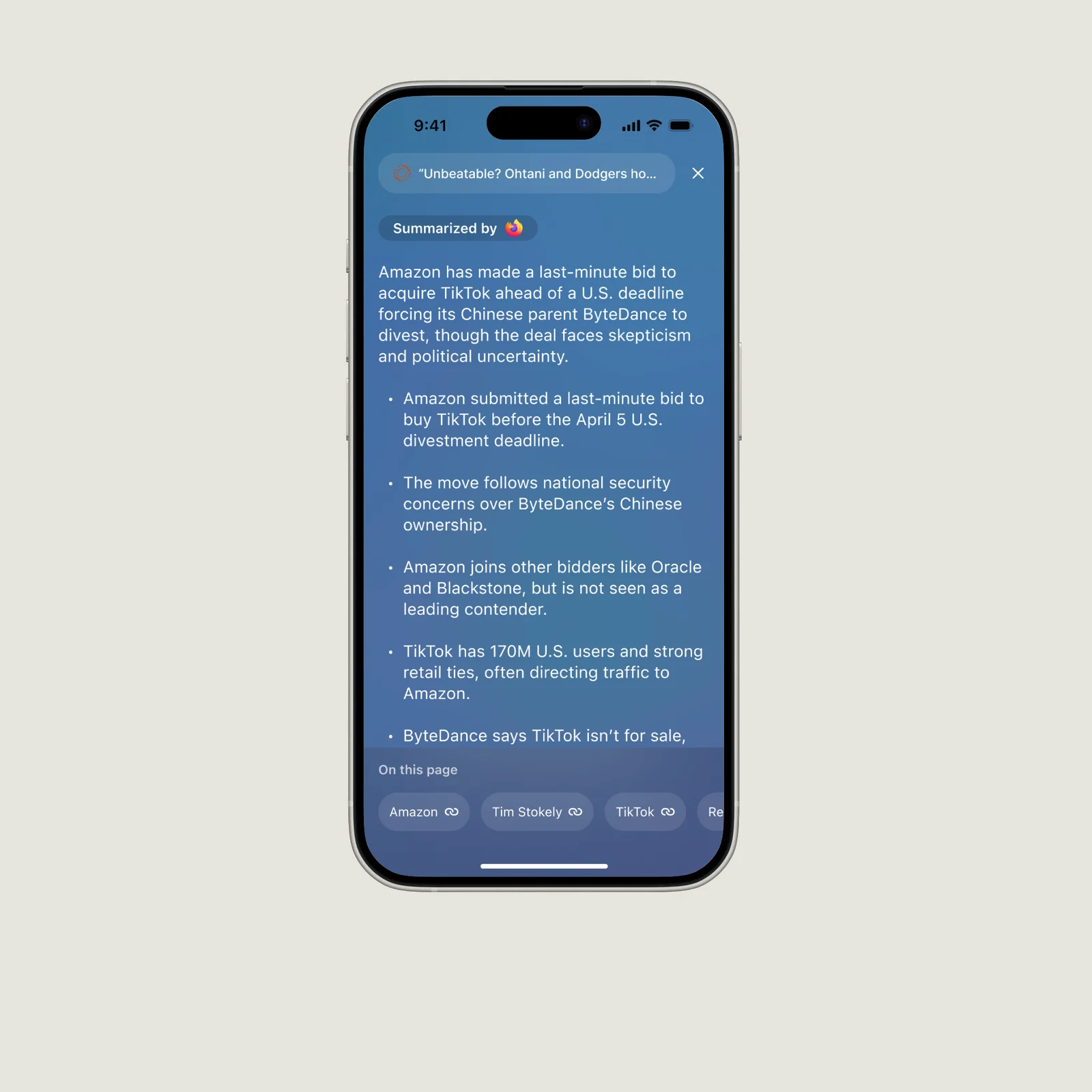
- “How does the content get displayed on screen? A wall of text would defeat the purpose of a summary.”
- “Would website owners get mad at this feature if we didn’t include the paid links?”
- “Is it correct to feel like you’re entering into a new experience? Or should we provide an anchor to ground the user in where they’re at?”
- “Can we invest in good animation to transport the user from one experience to another?”
- “Do we need to consider the ad revenue a website received from the web page?”
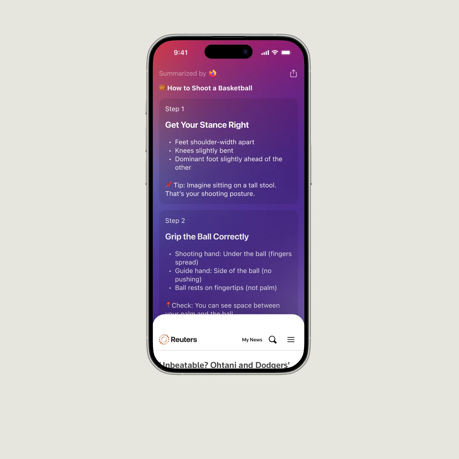
- “Can we transform text into different forms?”
Animation
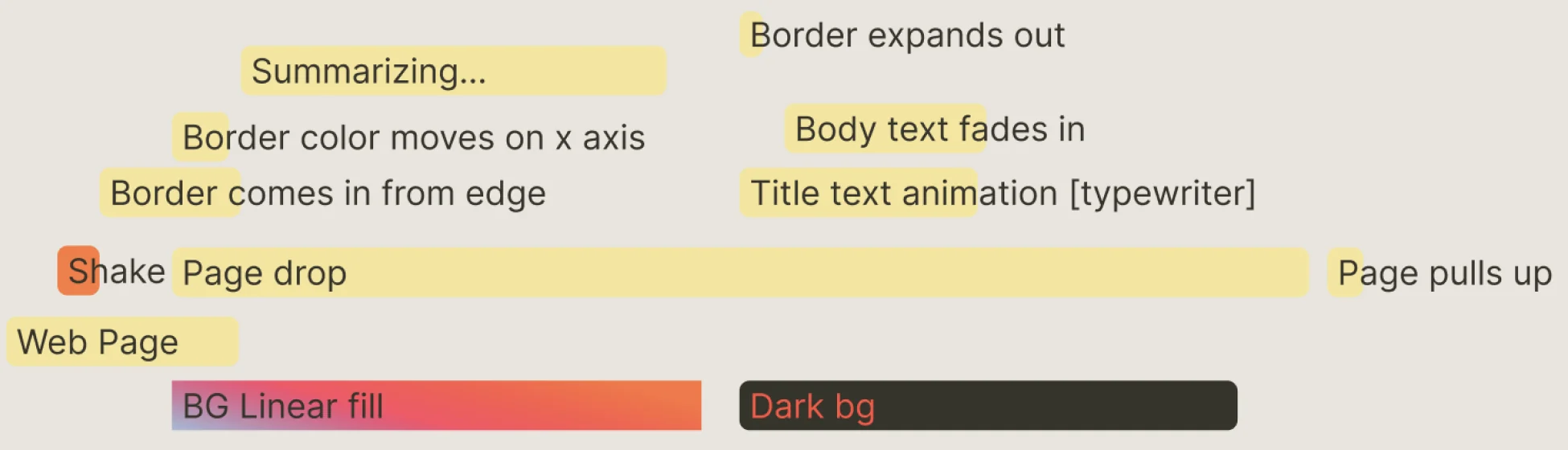
Once we narrowed in on a visual language, we began working with engineering to develop an animation that felt intuitive and obvious.
Engineering
Designs in hand, we changed gears to work closely with engineering to turn it into reality.
We needed to answer any doubt the team had, so we created an automation that would serve as the foundation for how the summaries would be created: test prompt → get website data → request Firefox Reader Mode → Mistral → deliver summary.
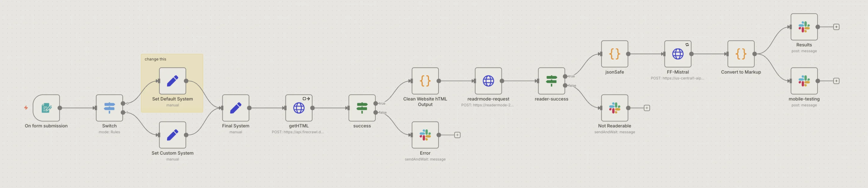
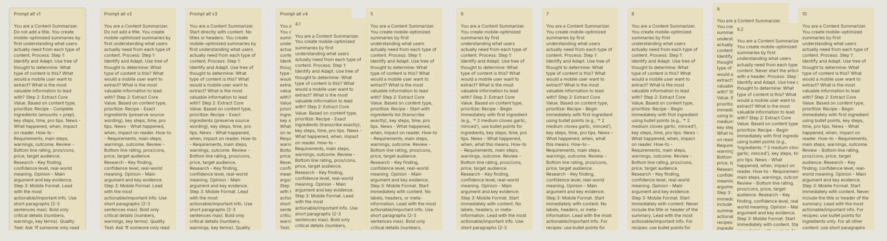
It all hinged on a good prompt
We quickly found that the success of this project hinged on a good prompt. We went through multiple iterations and fine-tuned it to perfection, against four constraints:
- Under 350 words
- Summarizes recipes perfectly
- Output still provides value depending on the type of content
- Format delivery is good (no awkward spacing or punctuation)
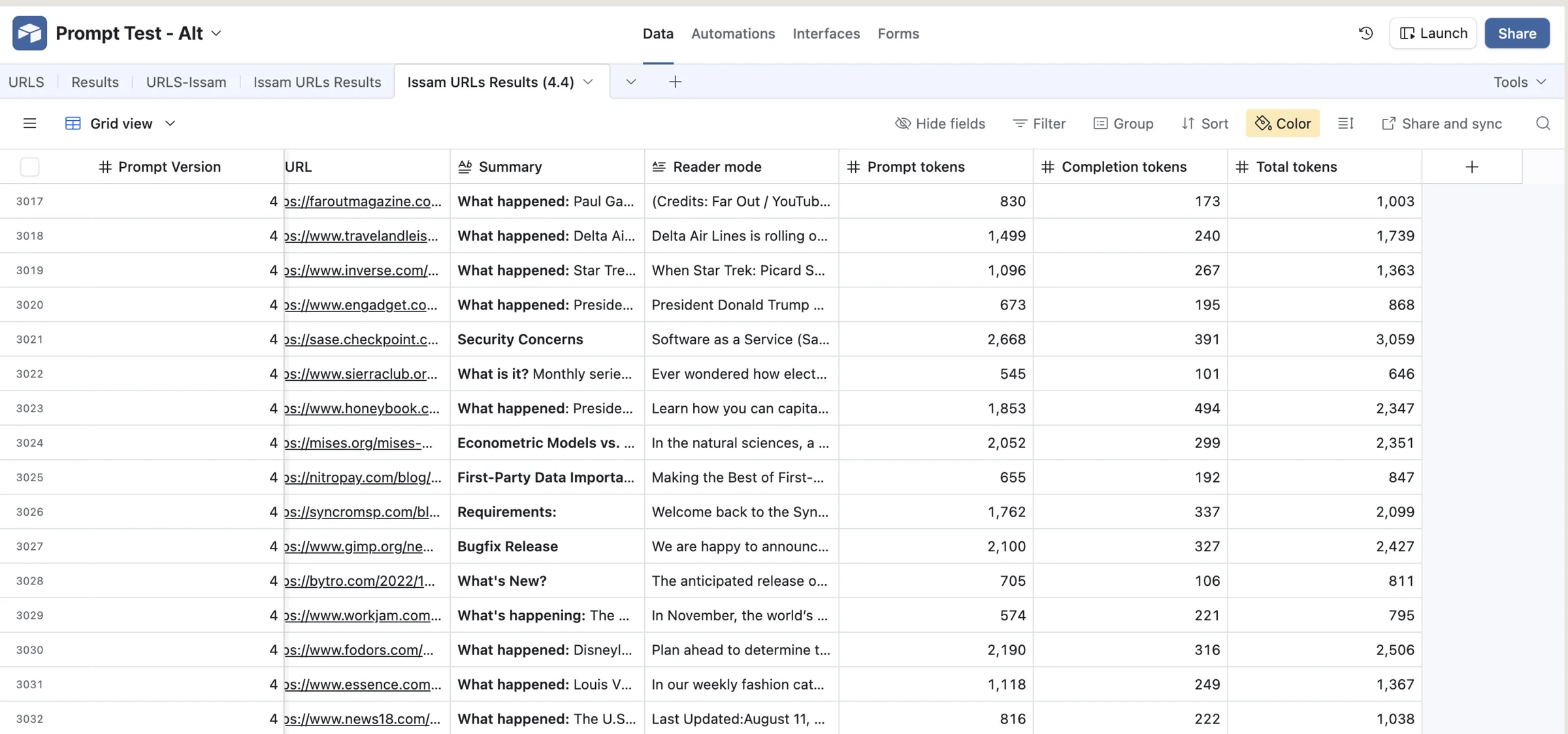
Testing at scale
We tested thousands of articles on our prompt to make sure the output met our quality standards.
It felt like magic.
After all the legal sign-offs, the edge cases, and release schedules were finally wrapped up, it was time to feel the final product in our hands.
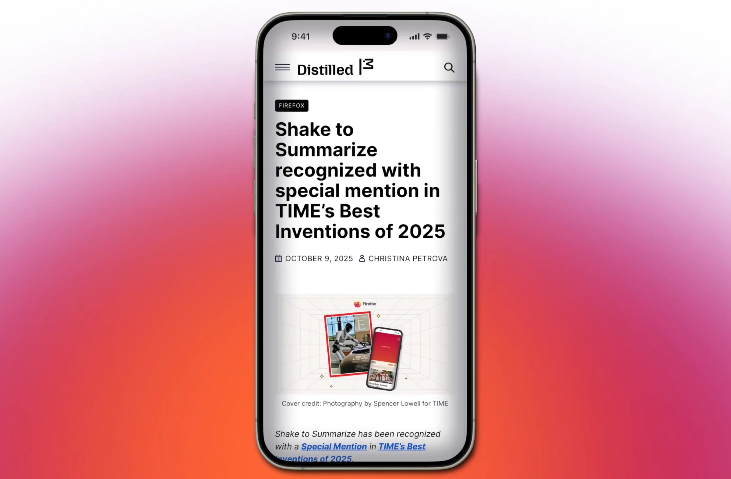
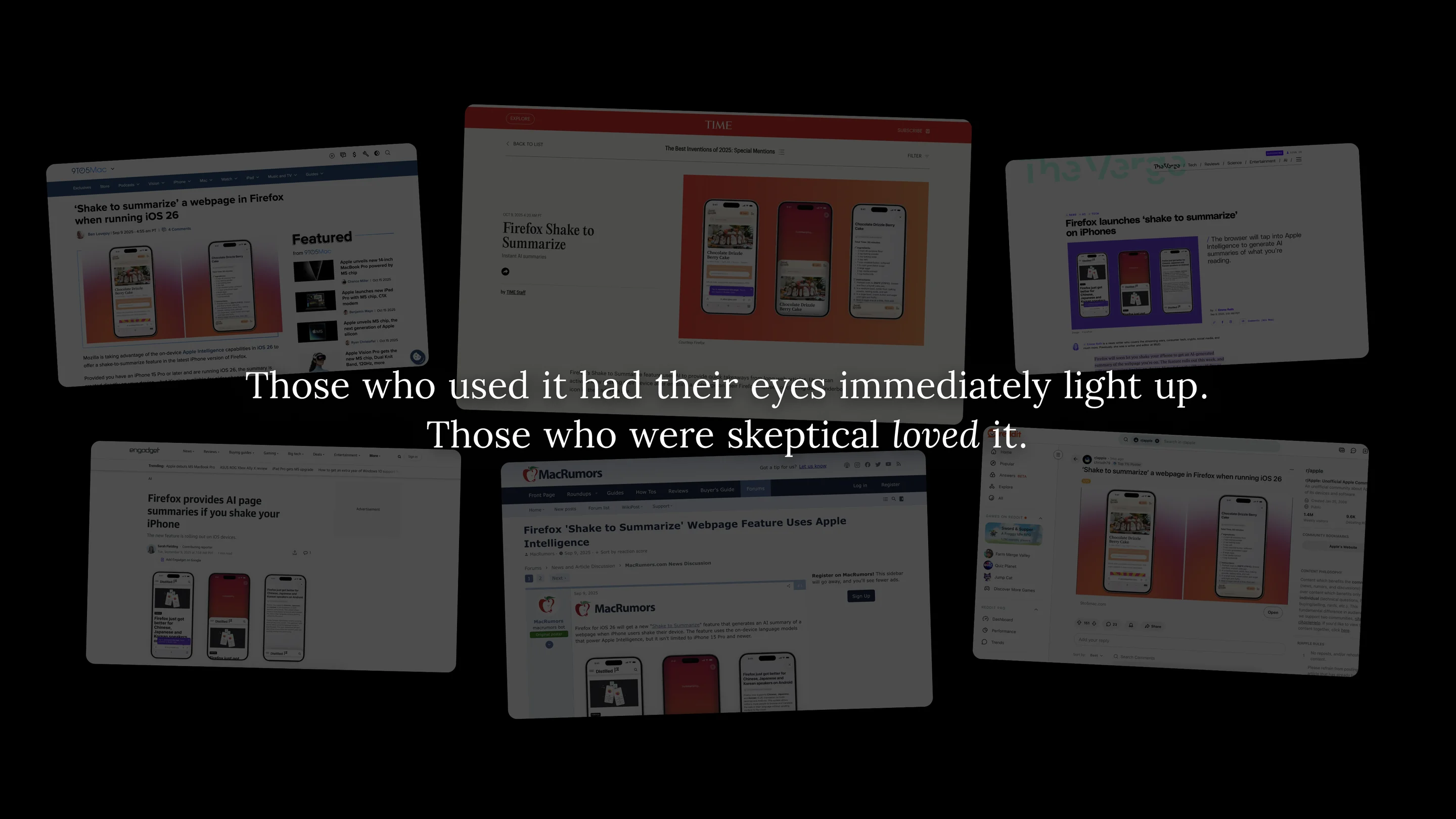
Those who used it had their eyes immediately light up. Those who were skeptical loved it.
Most importantly…